Infographic
Context
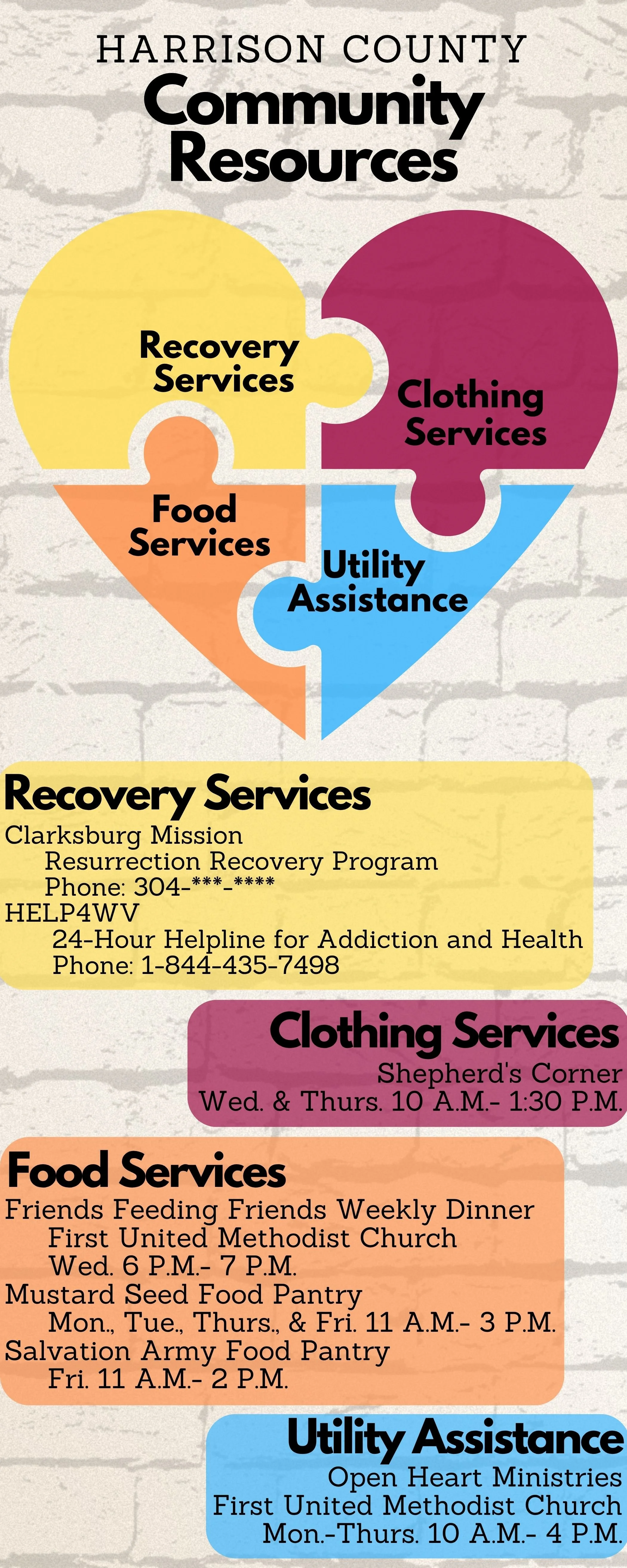
This infographic was developed for EME 5602, Technology and Design, to apply core visual, graphic, and multimedia design principles in a real-world context. I chose to take a list of community resources, a two-page, text-heavy document, and rework it into a single-page visual that was easier to read, understand, and distribute. The goal was to create something that could be printed and shared through churches or community centers to help individuals quickly find local support services.
Conditions
To simulate a real client-based project, I asked my husband, an associate pastor, if his church had any needs. He gave me a document of community resources, and I transformed that content into an infographic using Canva. I worked independently, using tools and concepts learned in class to create something informative and visually clear. The final infographic includes service categories, locations, phone numbers, and a symbolic graphic to tie everything together.
Scope
The infographic was designed for a general community audience, specifically people seeking help with basic needs like food, clothing, or shelter. It's intended for an educational context, to inform people of where and how they can get help. I included key details and organized the information visually so that even someone skimming the graphic could quickly find what they need. The final design is simple but impactful, with a clean layout and emotional resonance.
Role
My role involved every step, from brainstorming and planning to design and final edits. I started by narrowing down which services to include, then structured the layout around a heart-shaped puzzle graphic to visually represent compassion and connection. I also selected a tetradic color scheme and ensured the fonts, alignment, and spacing created a clean and accessible visual experience.
Key Competencies Demonstrated
Graphic Design Principles
Chunking: I grouped services into clear sections (food, clothing, shelter), making the information easier to scan.
Alignment & Proximity: Text and visuals were carefully aligned both vertically and horizontally to maintain order and readability.
Consistency: Fonts, colors, and graphic styles remained uniform to avoid visual clutter.
Simplicity: I prioritized clarity over decoration, avoiding the use of icons or images that might distract from the main information.
Contrast: I used a soft-colored background with strong contrast to ensure all text was readable.
Development & Tool Use
Used Canva to create and edit the infographic.
Applied design strategies like color scheme and font hierarchy to enhance impact.
*Below are links to other infographics that I have designed.